This is kind of old news as I neglected to post about this project for Adobe Flex Builder 4 (Gumbo). Prior to Max 2008 in October, I was on a team at EffectiveUI that was called upon to create some themes to be packaged with Flex Builder 4. They wanted preview the feature and the designs during Max, so we were on a pretty tight schedule.
We also had to work with some of the new components using FX-G. This was a nice introduction into the FX-G framework and how their new model for components and the styling and skinning of them.
Please note:
These themes were designed to be used with the Gumbo preview release during Max 2008. Since then, there have been some changes to the SDK, most notably the use of namespaces for Gumbo and Spark skins. I will write a post on this soon.
We ended up creating 6 themes, some varying from pure CSS, to some using graphical skins as both bitmaps and Flash symbols.
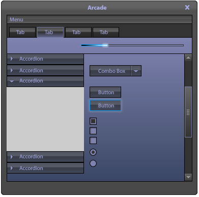
- Arcade

- Blue Steel

- Breeze

- Cobalt

- Graphite

- Zen Natural

The various themes were created by a few individuals on our production team, including Todd Hebenstreit, Jeremy Graston, Juan Sanchez, and myself (Zen natural).
These themes provide several options for providing your Flex application a little more customized look if you don’t want the basic default set.
Again, please note there have been some changes to the FX-G framework since these themes were created and these were designed to work with the Gumbo Build released during Max 2008, and some new namespaces have been introduced for Gumbo/Spark skins. I’ll be writing a post about this soon.
You can download the themes directly from this link:
http://download.macromedia.com/pub/labs/gumbo/gumbo_samplethemes_111708.zip
or visit:
http://labs.adobe.com/technologies/gumbo/
Hi, I’m trying to use these themes with Flash Builder but receive the following error message them:
“The selected theme has errors. It cannot be compiled.”
Looking at the source, it appears these were built using the old FxButton etc syntax for the Spark components. Are there plans to update them or have they already been updated and made available anywhere else?
Thanks in advance!
Holly
Holly,
You are correct, these were built using the older FX syntax.
As for updated themes…
Adobe should be releasing the new Spark and mx (replaces fx) compatible themes very soon. Unfortunately I am not sure when they will be available. The new themes will work with Spark and the older Halo components, but unfortunately the ones mentioned in this post do not work with Fx 4 as you have found out.
I will definitely post about it once they are released.
If you can access the swf or bitmaps from these themes, you make a few adjustments to the CSS to apply them to the Halo components. It would require utilizing the new namespace addition to the CSS file and changing those selector types to:
/*Halo Namespace*/
@namespace mx “library://ns.adobe.com/flex/halo”;
mx|SelectorName{
property: value;
}
They have made some small modifications to properties, such as background-color is now content-background-color, and a few others.
However, if you are using the new Spark components, you will not only have to make adjustments to the CSS, but will also have to create MXML files for each skin.
Hello,
I’m new to flash builder related development. I have been messing around with creating skinClasses and mxml+css based themes.
I noticced the flash builder comes with some bundled themes including the one created by you (Zen). I checked its source files in the jdk directory and its a flash based file, and then the swf from that file is used in the swc file.
Can you please give some steps how you managed the file to create it in flash then use it in the flash builder project? I need to do that also, please let me know. thanks.
Abbas,
Glad to hear you are getting into Flex (Flash) development and Flash Builder.
There are several ways to skin Flex application and this will also depend on the SDK version you are using, primarily a difference, or more options, with Flex 4 vs. Flex 3.
The themes you are referencing are swc’s and are packaged up a little differently than normal, in order to work with Adobe’s theme switching feature. Normally, that file is a “stateless” swf.
With Flex 3 an 4, you can build your skins graphically with either bitmaps (pngs, jpgs, etc.) or vector based symbols in Flash, which is my preferred approach, because vector provides more flexibility with scaling and making corrections, plus you can keep all of your skins in a single swf/swc rather than a bunch of bitmaps.
You can also simply “re-theme” the default Halo (Fx3)/Spark(Fx4) them with adjustments to CSS. I would recommend this if your design is pretty simple, but it can be difficult to obtain a more custom design. You can visit the CSS style explorer for details:
http://examples.adobe.com/flex2/consulting/styleexplorer/Flex2StyleExplorer.html
You can bring all of these external assets into the project via CSS. Flash Builder even has an “import skins” file where it will even create some of the CSS for you automatically, but you will most likely have to perform some manual clean up and adjustments in the CSS.
When using a Flash (swf/swc) based theme, you have two options: “stateless” and “stateful”
Stateless, means that you will have one symbol for each state, such as Button_up, Button_over, Button_down, Button_disabled. A “stateful” approach uses one symbol in Flash and the states are presented across the timeline with some named states/keyframes and you would produce a swc. However, we had some issues using the “stateful” approach with performance issues, so we went back to using “stateless” approach with a swf.
Now, with Flex 4, you can use their new FXG (graphical framework) mark up to dynamically draw your skins. If you are more of a developer, this may be a better approach. This is straight forward with simple shapes and colors, but can get a little tedious and complicated with complex graphics and colors/gradients. If you need to handle complex color fills and shapes, that’s where Flash Catalyst comes in. You can use FC to translate visuals into FXG for you, including complex path data for non-basic shapes. When you do this approach, you would be creating and MXML file for each skin or skin part (depending on the component), and again, you will tie it together with CSS. Note: some CSS properties changed from Flex 3 to 4 which can be confusing.
I can’t cover every detail in this email, but if you visit my coworker/friend’s (Juan Sanchez) site: http://www.scalenine.com
You will be able to view several examples and styles, some a have test projects with source downloads which may help you even better than my explanation. There are not a lot of Flex 4/FXG based themes up yet, but you can pull the latest themes for Flex 4. You can find them in th eFlex 4 SDK under …/samples/themes
These were the latest ones I worked on for the final release of Flex 4.
Hey Patrick,
Thank you so much for such a detailed response.
I’m working on Flash Builder, with Flex 4. Today i discovered using Flex’s photoshop addon to direclty output all the images/skins for MX components from photoshop at once. Thats a really fast process, but i know spark is the new ‘in’ and i learned it can’t have ‘bulk’ skin outputs from photoshop etc.
I also tried catalyst but with my basic knowledge, only tweaking the curves, colors and using basic shapes seems very limiting.
I checked the .FLA file of your ZEN (source folder) to learn about all the states of each control.
Then i checked the .SWF file used by the ZEN theme in flash builder, thats what i’d call a ‘stateless’ file according to your email since it has seperaet graphics for each component state.
I couldn’t find a proper way to output ‘bulk’ skin components from Flash (even though i was able to install and use the flex addon for Flash Pro CS5).
What i did was use the .SWF file from your zen theme, decompose it to FLA, then replace all states of the button images and text field component, then pack it into a swf, and then add the SWF file to my Flash Builder project assets folder. I then used the mxml skinClasses from your zen theme’s source folder into my project, hooked it all up and i was able to see some of my flash-created components skins. I’ll call it a hack but thats the best i could do.
I was wondering if there’s some way to bulk output all the component state graphics from flash into a swf, in such a way that somehow i wouldnt have to work manually on the mxml classes related to each component (i see a load of them , one for each component, in your zen source folder).
And yes, i checked many of the scalenine skins and checkout out the source of some, but your flash method of outputting skins seems the most efficient and flexible 🙂
Oh yeah – I neglected to mention that Adobe has created some tools and plugins to use with other tools such as Photoshop.
And the approach I took with that Zen theme was I used FXG/MXML to pull in the symbols from the single swf. This could have been done with bitmaps as well, or drawn dynamically in the MXML (FXG).
If I understand your question correctly, it sounds like you would like to be able to consolidate all of the mxml skin files for each component?
I don’t think that is possible, because you would most likely be using CSS to reference the skin MXML file and assign it to a specific component/class, you have to reference an explicit file for that particular component. You could share an MXML skin file with a component that shares similar parts and states, but there are only a few of those and then obviously, your controls will look identical to others, which is fine if that is the intent.
The other issue trying to put all of the skin files into one, is that you might experience conflicts with the component attempting to inherit states that are not part of that component’s class. Example, if you have a visual state referenced for a selected state and tried to assign the skin to the TextInput, I believe it would throw an error since TextInput doe snot have a concept of “selected.”
So, doing that approach does add more files to your project to manage (graphics [swf,png,gif,jpg], MXML, and CSS), but that’s the only approach I am aware of if you are using Flex 4. In Flex 3, you could just get away with CSS and the graphical asset file(s).
Dear Patrick,
What I’ve been wanting to (and have partially achieved) is to:
a- use the Flash Pro to skin all the components inside a the single flash file (that the flex-addon-for-flash’s template provides. – image: http://is.gd/cKZim ).
b- Then output the single file (that has now all component states skinned) into swf
c- then import the swf file in my flash builder project.
d- then access each component’s skin using a mxml skin class (one for each component, just like your zen theme sourc files).
the part till exporting the swf file are easy. And i’m able to pull out individual component skin states from the swf file in my flash builder application (using the component mxml skin class files from your zen theme source).
What i’m unable to find out is, did you manually create all the mxml skinClass files or were they output automatically by some addon/method you use? (i’m referring to these files – image: http://is.gd/cKZld ).
An automatted way to generate the mxml skinClass files for all the components/controls is much mroe beneficial, if it exists, and whether or not you used it. 🙂
thanks
Ahhh.
Thanks for clearing that up.
I’m NOT aware of any feature that would automatically generate those .mxml skin files, but that’s actually not a bad idea. You would think that there would be some feature with the skin import that could at least start those files, since it already generates CSS, but creating the MXML is a bit more complicated and there are a lot more variables to deal with. Who knows, maybe that will be in a future release.
However, I did not write those off the top of my head either. I referenced the existing files they use with the default Spark theme and used those to gain a better understanding of the states supported and how Adobe was creating those files. You can review those in the SDK.
Hope that helps you.
Ok that cleared up what i was wondering about 🙂
I guess I’ll get my self used to the manual way of mxml skinClasses then :p untill someone at Adobe writes some addon for flash/photoshop to do that automatically for the controls/components (espcially Spark components 😉 )
Thank you!
By the way… if you are in Flash Builder 4, when you create a new skin, you can select the directory where your skins will reside, right-click or pull up the contextual menu, and select New>MXML skin. This will then prompt a dialogue were you can reference the Class or skin type you would like to base your new skin off of, and you have the option for Flash Builder to throw in the default Spark skin mark up. It can make it easier to reference and change out the attributes/parts you need for your custom skin.