Tag: Flex


Custom Spark Button Skin using MXML

July 16th, 2010 — 12:32pm

I’m just going to throw down a quick tutorial on how to create a custom skin for a Spark Button for Flex 4 using Flash Builder.

Everyone has their own folder structure for their projects, so mine may differ slightly from yours.

Assuming you already have a project started in Flex and a place to put your skins and/or CSS, we can start.

In Flash Builder, go to the directory where you want your skin (mine is src/assets/skins). Right-click to open the contextual menu or click File and go to “New>MXML skin.”

This will prompt a dialog to choose the name and type of skin you want to create.

Go ahead and call the skin what you want, in my example it will be called “Button_custom_skin”
(you don’t have to put the extension which is .mxml)

Now choose the “Host Component,” which is essentially the default component type you want to base this skin off of. You can search for it in the search field, and in this case we are looking for  simple “Button.”

Now after the Host Component is selected, you have the option to have it create a copy of the Spark skin template in your new file or you can deselect the CheckBox and start from scratch. If you’re unfamiliar with all of the pieces of a Button skin, I recommend you create a copy and then strip out the unnecessary items.

Open your new skin mxml file (it should open automatically upon creation).

You can see that Adobe has some comments in this file from the template and some script*. For the button we are creating you can remove all of the comments and the script tag and everything in between.

*Most of the script items provide the customization style properties for use with CSS and also some resizing and scaling management for all of the various pieces of the default Spark skin, like shadow, borders, highlights, etc., so if you did make a change to one item like the corner radius, you don’t have to worry about changing the radius for every single graphic element.

Now we still have all of  the graphical pieces, you can strip out all of this too, but leave the text layer near the bottom of the file. This is the label of the button which we will leave intact.

<?xml version="1.0" encoding="utf-8"?>
 
<s:SparkSkin xmlns:fx="http://ns.adobe.com/mxml/2009" xmlns:s="library://ns.adobe.com/flex/spark" 
             xmlns:fb="http://ns.adobe.com/flashbuilder/2009" 
			 minWidth="21" minHeight="21" 
			 alpha.disabled="0.6">
 
    <!-- host component -->
    <fx:Metadata>
        <![CDATA[ 
        /** 
         * @copy spark.skins.spark.ApplicationSkin#hostComponent
         */
        [HostComponent("spark.components.Button")]
        ]]>
    </fx:Metadata>
 
    <!-- states -->
    <s:states>
        <s:State name="up" />
        <s:State name="over" />
        <s:State name="down" />
        <s:State name="disabled" />
    </s:states>
 
    <!-- top layer: text -->
    <!--- @copy spark.components.supportClasses.ButtonBase#labelDisplay -->
    <s:Label id="labelDisplay"
             textAlign="center"
             verticalAlign="middle"
             maxDisplayedLines="1"
             horizontalCenter="0" verticalCenter="1"
             left="14" right="14" top="2" bottom="2">
		<s:filters>
			<s:DropShadowFilter distance="1" blurX="0" blurY="0" color="#000000" alpha=".4" angle="270"/>
		</s:filters>
    </s:Label>
 
</s:SparkSkin>

Now, we have a pretty empty file to start our skin. We’re going to make a button like the one shown below. Nothing fancy, but enough for this post.

Let’s break down the button into the parts we will need to create:
1) Border
This design has a small border around the edge that has a gradient. You can accomplish this with a “stroke” with a gradient fill. By default, strokes are set inside, so they won’t effect your component’s size. But the issue I have experienced with using strokes with rounded corners is that the corners get a little screwed up as if the stroke is on a fractional pixel. So, for our border, we will draw another rectangle behind the inner fill, and set the fill 1px in all around.

2) Fill
This is a rounded rectangle with a gradient from top to bottom. This will be drawn with a Rect and we will apply a corner radius (xRadius) property to it. No matter what size the button is in the layout, that radius will maintain the same value. Who needs scale 9 when you go this?

3) Label
We already left the Label from the Spark skin copy, but we need to add a shadow filter to give that inset look.

4) States
We need to ensure we have the correct appearance for all of the stats of a button: up, over, down, and disabled.

* You will also notice in the SparkSkin tag, there is a “minHeight”, “minWidth” and an “alpha.disabled” property. These are global parameters for this skin and you can adjust these if desired.

First, we will create a rectangle with corner radius (xRadius) and give it these attributes which I have pulled from the design:

<!-- border -->
   	<s:Rect height="100%" width="100%" radiusX="6"
			top="0" right="0" bottom="0" left="0">
	   <s:fill>
		   <!-- gradient fill colors - default ratios are 0,1 -->
		   <s:LinearGradient rotation="90">
			   <s:GradientEntry color="#ffcc00"
								/>
			   <s:GradientEntry color="#ff9900"/>
		   </s:LinearGradient>
	  </s:fill>
   	</s:Rect>

Next, we will draw the inner fill rectangle which will need to be 1px from top, right, bottom, left to ensure the border is exposed underneath and “appear” that it is a 1px stroke. Note that I am making the xRadius 5 – 1 less than the fill since it reside 1px inside. You could write some script to make this a variable to be shared across any object with this attribute if it was the same.

<!-- inner fill -->
	<s:Rect height="100%" width="100%" radiusX="5"
			top="1" right="1" bottom="1" left="1">
		<s:fill>
			<!-- gradient fill colors - default ratios are 0,1 -->
			<s:LinearGradient rotation="90">
				<s:GradientEntry color="#ff9900"
								 color.over="#fabe00"
								 color.down="#cc6600"/>
				<s:GradientEntry color="#cc6600"
								 color.over="#e17b00"
								 color.down="#ff9900"/>
			</s:LinearGradient>
		</s:fill>
	</s:Rect>

We have the base state of our button (up). Now let’s go back and add the color variances in the states. You do this by adding color.state=”#XXXXXX” as needed. Our border does not change and the disabled state we ahve already declared in the SparkSkin tag to be alpha.disabled=”.6″

So here is our code so far for the graphics.

<!-- border -->
   	<s:Rect height="100%" width="100%" radiusX="6"
			top="0" right="0" bottom="0" left="0">
	   <s:fill>
		   <!-- gradient fill colors - default ratios are 0,1 -->
		   <s:LinearGradient rotation="90">
			   <s:GradientEntry color="#ffcc00"
								/>
			   <s:GradientEntry color="#ff9900"/>
		   </s:LinearGradient>
	  </s:fill>
   	</s:Rect>
 
	<!-- inner fill -->
	<s:Rect height="100%" width="100%" radiusX="5"
			top="1" right="1" bottom="1" left="1">
		<s:fill>
			<!-- gradient fill colors - default ratios are 0,1 -->
			<s:LinearGradient rotation="90">
				<s:GradientEntry color="#ff9900"
								 color.over="#fabe00"
								 color.down="#cc6600"/>
				<s:GradientEntry color="#cc6600"
								 color.over="#e17b00"
								 color.down="#ff9900"/>
			</s:LinearGradient>
		</s:fill>
	</s:Rect>

Now, here is our full skin mark up code. I am going to reserve some attributes to be handled in the CSS to pull in this button, like the font-size and font-weight, but you could also hard code this int the skin as part of the Label attributes.

<?xml version="1.0" encoding="utf-8"?>
 
<s:SparkSkin xmlns:fx="http://ns.adobe.com/mxml/2009" xmlns:s="library://ns.adobe.com/flex/spark" 
             xmlns:fb="http://ns.adobe.com/flashbuilder/2009" 
			 minWidth="21" minHeight="21" 
			 alpha.disabled="0.6">
 
    <!-- host component -->
    <fx:Metadata>
        <![CDATA[ 
        /** 
         * @copy spark.skins.spark.ApplicationSkin#hostComponent
         */
        [HostComponent("spark.components.Button")]
        ]]>
    </fx:Metadata>
 
    <!-- states -->
    <s:states>
        <s:State name="up" />
        <s:State name="over" />
        <s:State name="down" />
        <s:State name="disabled" />
    </s:states>
 
	<!-- border -->
   	<s:Rect height="100%" width="100%" radiusX="6"
			top="0" right="0" bottom="0" left="0">
	   <s:fill>
		   <!-- gradient fill colors - default ratios are 0,1 -->
		   <s:LinearGradient rotation="90">
			   <s:GradientEntry color="#ffcc00"
								/>
			   <s:GradientEntry color="#ff9900"/>
		   </s:LinearGradient>
	  </s:fill>
   	</s:Rect>
 
	<!-- inner fill -->
	<s:Rect height="100%" width="100%" radiusX="5"
			top="1" right="1" bottom="1" left="1">
		<s:fill>
			<!-- gradient fill colors - default ratios are 0,1 -->
			<s:LinearGradient rotation="90">
				<s:GradientEntry color="#ff9900"
								 color.over="#fabe00"
								 color.down="#cc6600"/>
				<s:GradientEntry color="#cc6600"
								 color.over="#e17b00"
								 color.down="#ff9900"/>
			</s:LinearGradient>
		</s:fill>
	</s:Rect>
 
    <!-- top layer: text -->
    <s:Label id="labelDisplay"
             textAlign="center"
             verticalAlign="middle"
             maxDisplayedLines="1"
             horizontalCenter="0" verticalCenter="1"
             left="14" right="14" top="2" bottom="2">
		<s:filters>
			<s:DropShadowFilter distance="1" blurX="0" blurY="0" color="#000000" alpha=".4" angle="270"/>
		</s:filters>
    </s:Label>
 
</s:SparkSkin>

Now create a CSS file or add your CSS directly in your page. If you make an external stylesheet, make sure to reference the file in your main application.

I am using Button as my Class, and my selector is customButton, but you can name it anything.

s|Button.customButton {
	skinClass: ClassReference('assets.skins.Button_custom_skin');
	color: #ffffff;
	font-size: 12px;
	font-weight: bold;
}

Now in my application, I have 3 buttons on the stage.

  1. Spark Button with no styles
  2. Custom Button
  3. Custom Button made to look like the design.

Here is the markup of the Application.

<?xml version="1.0" encoding="utf-8"?>
<s:Application xmlns:fx="http://ns.adobe.com/mxml/2009" 
			   xmlns:s="library://ns.adobe.com/flex/spark" 
			   xmlns:mx="library://ns.adobe.com/flex/mx" 
			   minWidth="955" minHeight="600">
	<!--
	******************************************************************************************************
	// ** Project info: Custom Skin for Spark Button Demo **
	//	Author: Patrick Hansen | http://wwww.patrickhansen.com
	******************************************************************************************************
	-->
 
	<!-- default fx declations tag (not really needed for this example) -->
	<fx:Declarations>
		<!-- Place non-visual elements (e.g., services, value objects) here -->
	</fx:Declarations>
 
	<!--Styles -->
	<fx:Style source="assets/css/base.css"/>
 
	<!-- VGroup Container -->
	<s:VGroup gap="20">
		<!-- button example -->
		<s:Button label="Unstyled Spark Button"/>
 
		<!-- custom button example -->
		<s:Button height="24" label="Custom Skin Button" styleName="customButton"/>
 
		<!-- custom button example as design noted -->
		<s:Button height="24" label="MY BUTTON" styleName="customButton"/>
	</s:VGroup>
 
</s:Application>

Note: I left the height attribute (height=”24″) to be applied in the layout, in case this style may be used on other sized buttons, but you could had code this into the skin if you prefer.

View the demo here (right click to view Source):
http://www.patrickhansen.com/demos/flex/SparkButton/

Download the Source:
http://www.patrickhansen.com/demos/flex/SparkButton.zip

By the way, tools like Fireworks, Photoshop and Illustrator have export to FXG options where you can obtain most of this mark-up easily, but I wanted to demonstrate creating this skin from scratch.

The Complete National Geographic Experience

December 21st, 2009 — 9:38am

I think we’re all familiar with the yellow bordered magazines, be it in your current subscription lists, parent’s collection, library exposure, or the scrap book collection in art class. I am referring to the iconic National Geographic Magazine.

national geographic complete

National Geographic has brought their entire collection, from 1888 to 2008 into the digital world with the recent version of the Complete National Geographic Software experience which includes the past 120 years of National Geographic accessible through your desktop computer!

The company I work for, Effective UI, was the UX agency behind creating this year’s version o the collection. Our team did an excellent job bringing this unique software experience to life and making it an enjoyable and exciting adventure throughout the past 120 years of magnificent National Geographic content, including the intriguing articles from around the world and of course, I must mention the visual thrill ride of their amazing photography. The other cool aspect is that this presents the issues an volumes exactly how they were originally published including the advertisements dating back to their first volumes in the late 19th century (1888).

Not only can you go through the volumes in a digital page by page metaphor, but the application also offers other features such as trivia and Geobrowse which allows you to search, correspond and relate articles geographically with an interactive global map.

The software was built with Adobe Flex (AS3.0) and wrapped in Adobe AIR, and is a cross-platform compatible software package with the Adobe Air Install.

For more info visit:

http://www.nationalgeographic.com/completeng/

Purchase from Amazon:

http://www.amazon.com/Complete-National-Geographic-Every-Issue/dp/1426296355/ref=dp_cp_ob_sw_title_0

Flex Stateful Skins vs. Stateless

October 13th, 2009 — 3:00pm

Explanation of Stateless and Stateful skins
There are several approaches to style and skin Flex applications. Adobe has also been nice enough to provide some special skinning extensions and kits to work in conjunction with the CS3-CS4 tools such as Flash, Fireworks, Photoshop and Illustrator.

These extensions provide templates and some export commands to assist the workflow of creating graphical skin and exporting them out to bring into your Flex application. Most of these workflows consist of using a “stateless” approach. This means there is an individual asset for each state of a component, such as an image for the up, over, down, and disabled states of a basic Button. The stateless approach can be used with AI, PS, FW and Flash. The nice thing about using it with AI and Flash, is that you can keep the graphics vector within a SWF, if that is your preference. In FW and PS, they will export as bitmaps.

As for the stateful approach, this had been my preferred choice for the past year or so. This requires the Flex skinning extension kit for Flash where it provides a Make Flex Component Command and provides the FlexComponentBase to your file which allows Flex to communicate and translate with the state and transition frame labels without having to write any additional script within Flash or Flex. This approach also utilizes the Embed Skin Class approach within the CSS v. the Embed Source as with stateless.

Example CSS for a Button
Stateful CSS:
Button.
{
skin: Embed(skinClass=”Button_skin”);
}

Stateless CSS:
Button
{
disabledSkin: Embed(source=”flex_skins.swf”,symbol=”Button_disabledSkin”);
downSkin: Embed(source=”flex_skins.swf”,symbol=”Button_downSkin”);
overSkin: Embed(source=”flex_skins.swf”, symbol=”Button_overSkin”);
upSkin: Embed(source=”flex_skins.swf”, symbol=”Button_upSkin”);
}

As you can see, in the stateful skin, you only need one symbol for all of your states of that particular component. The states are designed within the timeline of the individual symbol within Flash. Inside that symbol, there are two informative layers for Flex to communicate with and to be able to assign the appropriate state/transition to that particular component.

Those layers are states and transitions. A typical button would have frame labels of: up, over, down, disabled, selectedUp, selectedOver, selectedDown, selectedDisabled.

The stateless approach would require creating a separate symbol for each state of that particular component.

Now, for the main point of this post…

Issues with Stateful skins

The stateful skin approach was a channel later introduced by Adobe as one of their recommended workflows, and had seemed to be the most optimal in regards to efficiency and workflow in my opinion. Unfortunately, we (Project Team @ EffectiveUI) have discovered a major flaw with performance using stateful skins within a large Flex application where there are many instances of a component using a graphical skin. In smaller applications with minimal instances of a graphical skin, the performance hit is minimal and may not be noticeable, so it is proportional to the amount of objects using a graphical skin.

On a recent project, we saw a rather large percentage increase in CPU usage when using a stateful skin on a CheckBox and other components. There appears to be an OnEnterFrame recursion on UIMovieClip, which is the Base Class for a stateful skin. We weren’t sure if it was part of the swc, or how Flex was pulling it in and reading it, so we decided to run a quick test. We swapped out the stateful skin with a stateless version using the same exact graphical information in the fla, but just designed as stateless and compiled to a swf. Once the developer threw that into the app, the CPU usage dropped dramatically! It dropped to the expected percentage which should be almost identical to not using any CSS or external styling in your Flex application, since skins should not hit the CPU usage. So, it seems like we have narrowed down the issue to the use of stateful skins.
(note: There were issues on more than just the CheckBox, but this was one of the components we used to try to narrow down the issue)

The Test
A fellow coworker, Greg Owen – Lead Developer @ EffectiveUI, help me create a test environment Flex application (wrapped in AIR), which will instantiate several hundred CheckBoxes, this should provide enough performance in the app to see a hit on the CPU usage while using the stateful skin swc.

In the test app, we did some variations with stateful skins and here are the results:
Running 100 CheckBoxes + stateful skins – CPU usage = 19%
Running 250 CheckBoxes + stateful skins – CPU usage = 30%
Running 500 CheckBoxes + stateful skins – CPU usage = 50%
Running any # of CheckBoxes*—————- CPU usage = 10%
(*no added styles/skins)

You can download the source if you would like to try the test it yourself. You can go into the MXML and alter the amount of instances of the CheckBox, and you can swap the style sheets used between the stateful and stateless skins.

I have created two sets of skins for this CheckBox to swap out and review the difference in performance. One skin is a stateful symbol within a swc, and the other stateless skin is comprised of eight symbols, one for every state of a CheckBox, within the swf.


Download the source files here:

http://www.patrickhansen.com/demos/flex/SkinningTest.zip

Click below to view Greg Owen’s post about this issue:

http://behindtheui.blogspot.com/2009/03/flex-component-kit-cpu-black-hole.html

As a result, I plan on working with stateless skins from here on out until there is a resolution to this issue.I’m also planning on working with Degrafa and FX-G in FB4 more for skinning as well.

updated: March 2009
Here is the post for: Stateless vs. Stateful vs. Degrafa

*On a Mac, you can open the Activity Monitor under Applications/Utilities and you can check the CPU usage.

Flex & Flash Builder – what are they?

June 18th, 2009 — 11:29am

I’ve had a couple questions come at me lately about what is Flash Builder and how does it relate to Flex now.

This is nothing too technical, just a simple explanation.

Flash Builder

Flash builder is just Adobe’s Tool to develop Flex applications. It was formerly Flex Builder, but Adobe is attempting to unify the Flash name and branding across its tools so they changed the name. It is built on Eclipse which is a general IDE, but again, the focus is that it is simply the tool, and the Flex framework is still Flex.

The Flex framework primarily is based on MXML, a mark up language developed by Adobe. You can also use AS 3.0 to supplement the MXML. And yes, you can even tie it into other frameworks and languages such as Rails, Cold Fusion, PHP and a quite a bit more, especially if you need some server side tasks.

Flex compiles to a swf, similar to Flash, and utilizes the Flash Player in order to render it, or you can wrap it into an AIR desktop application.

An analogy is like HTML. It is a mark up language based framework for web pages. You can use a variety of tools to construct an HTML page(s), such as adobe Dreamweaver, Esspresso, Taco Edit, TextEdit, and even Notepad. You can also supplement it with Javascript. Of course, you can also tie it into the other frameworks and languages such as Rails, Cold Fusion, PHP, ASP.NET, and more. You can also use Flex and Flash to create components to embed into your web page such as video players and widgets. You can also wrap a web page into an AIR desktop application.

Category: Design

tags: , ,

Comment »

Flex 4 themes (Gumbo) – late post

May 26th, 2009 — 10:07am

This is kind of old news as I neglected to post about this project for Adobe Flex Builder 4 (Gumbo). Prior to Max 2008 in October, I was on a team at EffectiveUI that was called upon to create some themes to be packaged with Flex Builder 4. They wanted preview the feature and the designs during Max, so we were on a pretty tight schedule.

We also had to work with some of the new components using FX-G. This was a nice introduction into the FX-G framework and how their new model for components and the styling and skinning of them.
Please note:
These themes were designed to be used with the Gumbo preview release during Max 2008. Since then, there have been some changes to the SDK, most notably the use of namespaces for Gumbo and Spark skins. I will write a post on this soon.

We ended up creating 6 themes, some varying from pure CSS, to some using graphical skins as both bitmaps and Flash symbols.
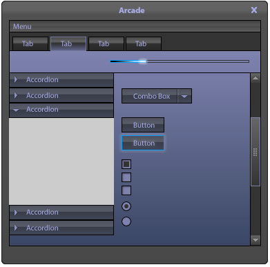
  • Arcade
  • Blue Steel
  • Breeze
  • Cobalt
  • Graphite
  • Zen Natural

The various themes were created by a few individuals on our production team, including Todd Hebenstreit, Jeremy Graston, Juan Sanchez, and myself (Zen natural).

These themes provide several options for providing your Flex application a little more customized look if you don’t want the basic default set.

Again, please note there have been some changes to the FX-G framework since these themes were created and these were designed to work with the Gumbo Build released during Max 2008, and some new namespaces have been introduced for Gumbo/Spark skins. I’ll be writing a post about this soon.

You can download the themes directly from this link:

http://download.macromedia.com/pub/labs/gumbo/gumbo_samplethemes_111708.zip

or visit:

http://labs.adobe.com/technologies/gumbo/

Stateful to Stateless JSFL – Flash Command Script

April 8th, 2009 — 3:16pm

After finding out that the stateful skinning approach was hitting the CPU pretty hard we had to go back and revise some skin/styling themes. This is can be a very time consuming process pending on the size of your theme and application.

Kevin Skrenes, a coworker and friend of mine who is a Senior Developer here at EffectiveUI, help smooth out the process for the conversion by writing a couple JSFL scripts for Flash. I really want to point out that Kevin Skrenes deserves A LOT of credit for this, but he doesn’t have a site or blog to publicize about it himself.

There are 3 scripts:
1) Create Stateless Symbols.jsfl
2) Remove Linkage Class Names.jsfl
3) Select Stateful Symbols.jsfl

Download the scripts here:

http://patrickhansen.com/resources/flash/StatefulToStatelessScripts_v1-0.zip

Install them in:
user/Library/Application Support/Adobe/Flash/en/Configuration/Commands
* this is on a Mac, not 100% sure what it is on Windows.
Make sure to quit Flash before installing.

Open Flash and you should see these commands under the Commands menu.

To convert:
Select the symbol(s) from the library you want to convert and use Create Stateless Symbols.

Linkage Class correction
Now, you may have some issues with the linkage Class. You should probably run this secondary script just in case to ensure you correct the linkage Class and ID to optimize it for stateless.

Removing old symbols
There is also a script to select any stateful symbols in the library, so you can delete them.

So, if you have some old legacy skins that are holding down your performance, go ahead and use these scripts to convert them, and hopefully save some time. :)

CSS
Remember, you will also have to correct your CSS for the new stateless skins.

Notes:
This is in its first round and there may be some issues with these scripts, so please let me know if you come across any.

Also, everything is not fully automated, so you may have to do some things manually.

It is possible to consolidate all of this into a single script, but we left them separate for our unique circumstances and scenarios.

Follow up on Stateful vs. Stateless skinning

April 1st, 2009 — 11:24am

Greg Owen posted a nice follow up on the EffectiveUI blog.

We worked with Adobe to see if we could work on something to help alleviate this issue, but even with a custom UIMovieCip Class Adobe provided, we still saw large CPU hit.

So, again, at this point, for larger applications, it is probably best to stick with stateless skins if you are going the graphical approach.

Read more on the post here:
EffectiveUI Blog

Stateful vs. Stateless now vs. Degrafa

March 25th, 2009 — 8:59pm

I just wrote a post about stateless vs. stateful graphical skins with Flash and Flex. We discovered there are some big performance issues with using stateful skins created in Flash (swc).

Greg Owen, a fellow coworker and lead developer at EffectiveUI, help me create a test app for this. The app is a Flex app wrapped in AIR, and has 3 style sheets which you can swap out to test the various skin options for a CheckBox which is being instantiated 500 times. (if you download the source, you can alter this value). This provides enough load to actually see the CPU hit.

I had a recent comment about using Degrafa and the comparisons, so with the help of Juan Sanchez, I was able to add a skin that is created in Degrafa programmatically and is a very close resemblance to the other skins being used in regards to colors and appearance of states.

skin test

We ran some tests today using 500 CheckBoxes and these were the results:

No skin/CSS – CPU = 13.5%
Stateless – CPU = 13.5% to 14%
Stateful – CPU = 47% to 50% Whoa!
Degrafa – CPU = 13.5% to 14.2%

So, it looks like Degrafa does not have that large of a hit on the performance and if you are using it to skin yoru Flex apps, then you should be good to go!

(results are on a MacBook Pro 2.33GHZ Intel Core 2 Duo 2GB RAM.
Please note, to get a true reading, the app should be in focus)

Download the source here:

http://www.patrickhansen.com/demos/flex/SkinningTest_v2.zip

Creating Visual Experiences with Flex 3.0

December 27th, 2008 — 10:07am

Creating Visual Experiences with Flex 3.0 is out!

Fellow coworkers Juan Sanchez and Andy McIntosh are official authors and have a really great book about the creative side of Flex development and design.

Published under Addison Wesley, this book provides a huge amount of information which is not only helpful to developers, but very well structured and written for designers to begin diving into a little Flex.

Even if you have absolutely no developmental experience, this book covers a lot of general design and visual UI methodologies & techniques for making that Flex application not only look great, but provide a great experience as well. We all know that even if an application looks awesome, it doesn’t necessarily mean the experience or work flow is on point.

The code samples are very easy to follow and complete, even for a novice. It can get very technical in some areas, but the way the information is provided in a clear and concise manner, makes it easy to follow along and get into. Based on the title, it is about visual experiences, and the book itself is also very visual with excellent diagrams, screenshots and attractive examples.

This is targeted for Flex 3.0, and even though Flex 4.0 is right around the corner, I can say that there is still a lot of stuff in this book which will continue to hold and be applied. I have dove into the new Flex 4.0 (gumbo) components and worked on styling/skinning of them, and even though they use a new technique with FXG, there are still many components that are not converted yet and will still use the various technique this book covers.

Another great part of this book, is that since Flex is similar to other development platforms, so are some of its visual aspects. You can explore and apply the concepts in this book towards general UI design and experience for a variety of platforms, although it does take a deeper dive into Flex 3.0.

Of course it sounds biased for me to support this book, but I am being honest when I say that this is a great book for a designer to either begin or advance their skills with the visual experience of Flex design/development. I have been working with this side of the process for about 2 years, and I still learned a lot from this book!

I’d also like to add that developers of all levels would benefit from this book too, even if you’re not very visual or have a sense for great design.

Adobe’s very own Narcisco Jaramillo contributed a great foreword also!

using Adobe Flex 4 SDK in Flex Builder 3

November 15th, 2008 — 8:06am

Want to get the Flex 4 early release SDK’s (aka Gumbo)?

Visit here:

http://opensource.adobe.com/wiki/display/flexsdk/Download+Flex+4

Download it and place it wherever you want, possibly in your Hard Drive root, Documents, wherever, it’s your preference, just don’t plan on moving it.

You can still use Flex Builder 3 as your IDE, and point your project to compile with the Flex 4 SDK.

Create a project and then right click on the project to pull up the Properties menu, choose Flex Compiler in the nav menu on the left.

Click on Configure Flex SDK’s link. In this wizard, click “Add” and pull in the the new Flex 4 SDK you just downloaded. Check off Flex 4, then click Apply.

You should now see this:

Make sure that the Flash Player version is set to 10.0.0 – or you may get a Matr5ix 3D type error since Flash Player 9 cannot handle the new 3D matrix framework.

After doing this for your first time, you will not have to add it anymore. Simply just choose which SDK to use from the list.*

*note: they do release new versions frequently, so if you do download the latest, you will have to Add it and remove the older version.

Back to top