A List Apart features another great article, this time on Responsive Web Design. This derives from an emergent discipline called “responsive architecture.” The philosophy focuses highly on “how physical spaces can respond to the presence of people passing through them.”
This concept can be applied to other arenas outside of physical structures which already have the technology and flexibility to adapt, web and software interfaces. Now, the concept of adapting UI’s isn’t new, but the techniques used both in the technologies used and the experience/design vary in solutions and some are arguably not the best.
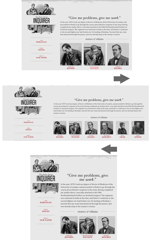
Fluid layouts in web design have been around for awhile, and although they do achieve flexible design and presentation and are quite successful for desktop device viewing, they are not full proof across multiple devices such as mobile phones to tablets.
Ethan Marcotte provides a great article which goes further in depth of this concept and he provides an excellent responsive web design layout example. Even the images scale smoothly to accommodate the various layouts. The examples do have some dependencies on javascript/JQuery for some of the more advanced image handling and media queries which shoudl also be considered when designing a responsive layout.
There are several examples demonstrating approaches for various resolutions. Catch the article here:
http://www.alistapart.com/articles/responsive-web-design/
Another nice example of a responsively designed website is the designer/developer job board at http://www.findbacon.com
That is a very nice example of a currently live site using a responsive layout for a very practical implementation. Thanks for sharing that.
With all of the device types, such as various sized tablets and smart phones, hitting the market recently, and usage statistics showing vast increases of internet usage from these devices, responsive layout is an aspect of web design that should not be neglected.