If you’re in the design and tech world, you have probably seen these memes passed around the internet attempting to explain the difference between UI Design (User Interface) vs. UX Design (User Experience).
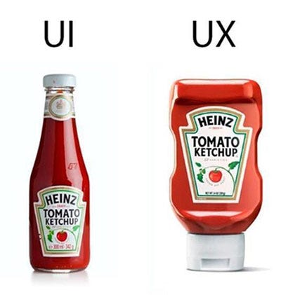
One like the ketchup bottle meme:
Or perhaps you have seen the walking path meme floating around lately
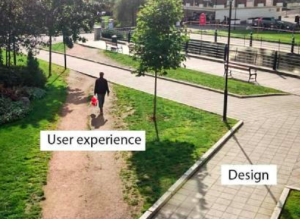
THEY ARE BOTH INCORRECT!
Although the intent of these memes have some truth behind them, they are explaining these concepts incorrectly.
This is not the clearest way to explain the differences between UI and UX, or UI Design vs. User Experience.
If we are going to use walkways or ketchup bottles as a means to explain UI vs. UX, then let’s look at it more like this:
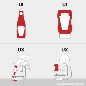
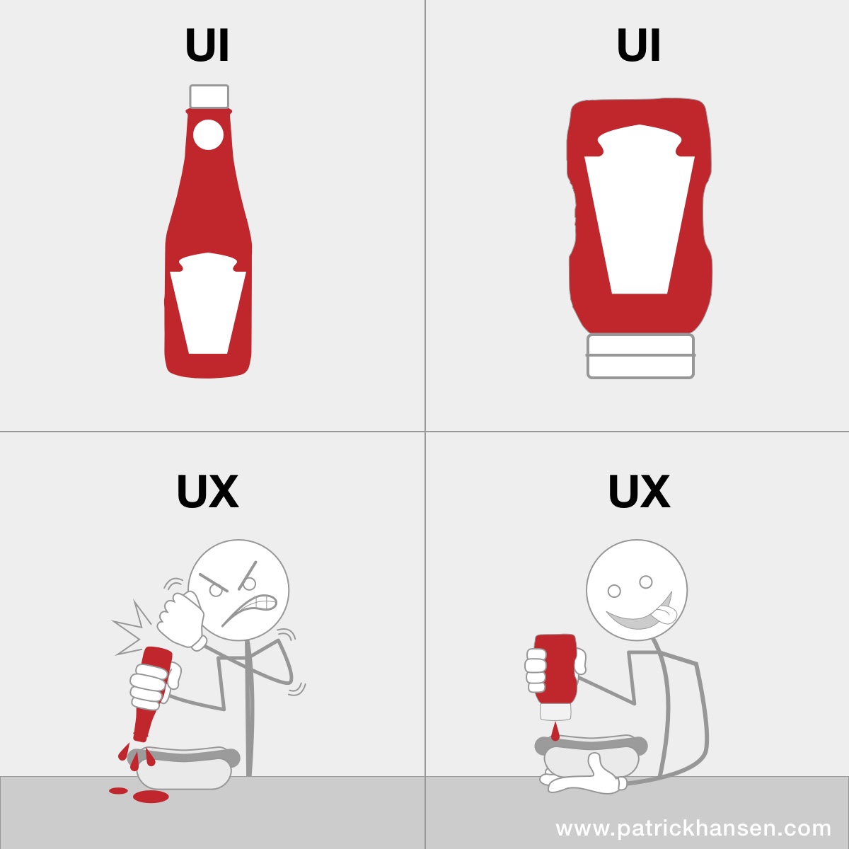
Both ketchup bottles are UI’s (User Interfaces).
- They both are the interface in which the user will engage and interact with the product as far as servicing the use case of the user wanting to apply ketchup from a storage bottle to their food or dish.
- They are both user interface designs.
Both ketchup bottle designs have their own UX (User Experience).
- The traditional bottle design on the left has an experience that many find to be be frustrating or difficult to work with to get the contents out. However; it is still a solution, perhaps not the most enjoyable one. It probably did not consider user needs as much as manufacturing needs to have a container for ketchup that could keep it fresh and be portable.
- The bottom-spout bottle design on the right is arguably a better and more enjoyable experience for the user. This design may have taken into account more user research to help inform a design that could produce a better experience. It likely provides less frustration and removes the need to have to shake it or pound it to expel its contents.
The Walkways
Both walkways are UI’s (User Interfaces).
- They are both the interface in which a user will travel from one point to another on the property.
- Both of them were designed by either a landscape designer or the actual pedestrians who carved out the path.
Again, both walkways (UI’s) have their own UX (User Experience).
- The brick paver walkway is the interface that was probably designed by the landscape designer. It aligns well with the other walkways, intersections, landscaping, along with the other designs for transportation throughout the property. However; it may may not have been considered very “convenient” by the users to get from one point to another.
- The dirt path walkway (shortcut) is the interface that was designed by the users on their own. The users likely felt that it was more efficient and convenient to simply cut through the grassy patch rather than use the brick walkway. Technically, it is “faster” or less distance to travel. This one is interesting, because this example is an interface that allowed the users to not only think of, design and customize their own solution, but they actually were able to execute on it. The fact that it wore the grass down to dirt is validation that many users prefer this route. However; this route does have consequences on the surrounding landscape.
Some other touch points I want to note on:
The traditional ketchup bottle design was a simple and existing design that was likely a quick and efficient way to package the product, get it to market and still allowed end-users/customers to accomplish the task at hand, and allowed the business to accomplish its goals to get it to the marketplace.
After some time in the marketplace, companies probably learned from internal research and customer feedback that it could be challenging to get the contents out of the traditional bottle. The bottle company probably then applied those findings to make a more informed bottle design that would please their customers. Technology and manufacturing processes may have influenced this as well. It just takes time and the ability to consume feedback, analyze it, and then enhance or improve the design.
The new bottom-spout bottle design provides its own experience. If it is actually better, then it is likely a design that users will return to and desire in the future. This is an example showing a UX differentiator in a product. If the design (both UI and UX) are done well and users/customers enjoy their experience, then they will not only continue using that product/service, but they may pay more money for a “better” experience, and likely encourage others to do so as well.
Now, the taste and ingredients of the contents are other variables in the design that also contribute to the User Experience, but that’s another blog post.
*note: Heinz and the Heinz ketchup bottles are a registered trademark of The Heinz Corporation and is in no way related or associated with the creation of the meme above, this post or this website. The meme was pulled from a public social media source and used for this demonstration.
Perfect post. Great graphic BTW
Thanks, man! Hope you’re doing well out in CA.
I believe the bottle UI originated from a lack of any other alternative – injection molding and plastics technology weren’t around when Heinz first established their product.
Great post!
Thanks for the comment. Yes, I agree, there were probably some technical limitations with manufacturing which forced the original bottle design, yet it still functioned. Even the new design still has issues, like when the water settles to the bottom, it can have a tendency to leak out and not be noticed since the cap is covering the bottom of the bottle.
[…] seen on patrickhansen.com, together with an in-depth […]