I’m just going to throw down a quick tutorial on how to create a custom skin for a Spark Button for Flex 4 using Flash Builder.
Everyone has their own folder structure for their projects, so mine may differ slightly from yours.
Assuming you already have a project started in Flex and a place to put your skins and/or CSS, we can start.
In Flash Builder, go to the directory where you want your skin (mine is src/assets/skins). Right-click to open the contextual menu or click File and go to “New>MXML skin.”

This will prompt a dialog to choose the name and type of skin you want to create.

Go ahead and call the skin what you want, in my example it will be called “Button_custom_skin”
(you don’t have to put the extension which is .mxml)
Now choose the “Host Component,” which is essentially the default component type you want to base this skin off of. You can search for it in the search field, and in this case we are looking for simple “Button.”

Now after the Host Component is selected, you have the option to have it create a copy of the Spark skin template in your new file or you can deselect the CheckBox and start from scratch. If you’re unfamiliar with all of the pieces of a Button skin, I recommend you create a copy and then strip out the unnecessary items.
Open your new skin mxml file (it should open automatically upon creation).
You can see that Adobe has some comments in this file from the template and some script*. For the button we are creating you can remove all of the comments and the script tag and everything in between.
*Most of the script items provide the customization style properties for use with CSS and also some resizing and scaling management for all of the various pieces of the default Spark skin, like shadow, borders, highlights, etc., so if you did make a change to one item like the corner radius, you don’t have to worry about changing the radius for every single graphic element.
Now we still have all of the graphical pieces, you can strip out all of this too, but leave the text layer near the bottom of the file. This is the label of the button which we will leave intact.
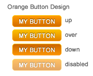
Now, we have a pretty empty file to start our skin. We’re going to make a button like the one shown below. Nothing fancy, but enough for this post.
Let’s break down the button into the parts we will need to create:
1) Border
This design has a small border around the edge that has a gradient. You can accomplish this with a “stroke” with a gradient fill. By default, strokes are set inside, so they won’t effect your component’s size. But the issue I have experienced with using strokes with rounded corners is that the corners get a little screwed up as if the stroke is on a fractional pixel. So, for our border, we will draw another rectangle behind the inner fill, and set the fill 1px in all around.

2) Fill
This is a rounded rectangle with a gradient from top to bottom. This will be drawn with a Rect and we will apply a corner radius (xRadius) property to it. No matter what size the button is in the layout, that radius will maintain the same value. Who needs scale 9 when you go this?
3) Label
We already left the Label from the Spark skin copy, but we need to add a shadow filter to give that inset look.
4) States
We need to ensure we have the correct appearance for all of the stats of a button: up, over, down, and disabled.
* You will also notice in the SparkSkin tag, there is a “minHeight”, “minWidth” and an “alpha.disabled” property. These are global parameters for this skin and you can adjust these if desired.
First, we will create a rectangle with corner radius (xRadius) and give it these attributes which I have pulled from the design:
Next, we will draw the inner fill rectangle which will need to be 1px from top, right, bottom, left to ensure the border is exposed underneath and “appear” that it is a 1px stroke. Note that I am making the xRadius 5 – 1 less than the fill since it reside 1px inside. You could write some script to make this a variable to be shared across any object with this attribute if it was the same.
We have the base state of our button (up). Now let’s go back and add the color variances in the states. You do this by adding color.state=”#XXXXXX” as needed. Our border does not change and the disabled state we ahve already declared in the SparkSkin tag to be alpha.disabled=”.6″
So here is our code so far for the graphics.
Now, here is our full skin mark up code. I am going to reserve some attributes to be handled in the CSS to pull in this button, like the font-size and font-weight, but you could also hard code this int the skin as part of the Label attributes.
Now create a CSS file or add your CSS directly in your page. If you make an external stylesheet, make sure to reference the file in your main application.
I am using Button as my Class, and my selector is customButton, but you can name it anything.
s|Button.customButton {
	skinClass: ClassReference('assets.skins.Button_custom_skin');
	color: #ffffff;
	font-size: 12px;
	font-weight: bold;
}
Now in my application, I have 3 buttons on the stage.
- Spark Button with no styles
- Custom Button
- Custom Button made to look like the design.
Here is the markup of the Application.
Note: I left the height attribute (height=”24″) to be applied in the layout, in case this style may be used on other sized buttons, but you could had code this into the skin if you prefer.
View the demo here (right click to view Source):
https://www.patrickhansen.com/demos/flex/SparkButton/
Download the Source:
https://www.patrickhansen.com/demos/flex/SparkButton.zip
By the way, tools like Fireworks, Photoshop and Illustrator have export to FXG options where you can obtain most of this mark-up easily, but I wanted to demonstrate creating this skin from scratch.
Hello Patrick,
I came across your blog as I was having the same issues with the dodgy rendering of rounded corners and was browsing around trying to find a fix. The workaround with the back fill that you suggest works well, but I finally discovered the pixelHinting attribute of the stroke and that seems to fix the problem without the need for an extra fill. The alternative works like this, this stroke goes inside the rect statement:
Thanks for posting this comment. I haven’t heard of the pixelHinting attribute yet, so it is great to know that it is available and it helps with the rounded corner issue.
Appreciate the information! Thanks.
Awesome! Adobe’s docs sux. Nice work. Site looks great too!
hi! i have a problem i want that the button can adapt to the size the view want, i don’t want a fixed size in it. is it possible? thx
As long as the skin has width and heights set to 100% like the example, then the skin will scale to the button sizes declared in the view.
In the view, you you will want to set the width and/or height to 100% as well. Then the button will scale and adapt to the view as needed. You can set margins/padding on the parent container to also help with the layout if desired.
Button height=”24″ width=”100%” label=”Custom Skin Button” styleName=”customButton”